Introduction Nick Deakin
- Jodie Hirst
- Oct 6, 2015
- 2 min read
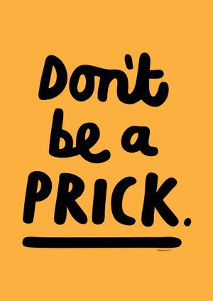
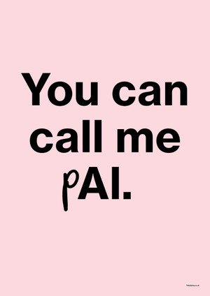
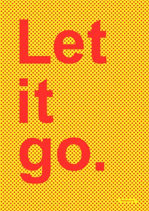
One of the things that Nick showed us was his print experimentation, something that really caught my eye, for my studio work I researched into Anthony Burrill and the way he uses letter press, it intrigued me when I saw Nicks work to be able to compare and expand on this further. Nicks approach to type was his phrases were less deep than Anthony Burril’s and more modern day adaptive, things like the ones below he then started to sell on tote bags, tote bags were something that Nick loved a one point and decided to put many things on them, he ever knew why really.


Nick is a good drawer, and he uses this to his advantage doing a lot of illustrations for company’s, newspapers and websites, here are a few I thought were interesting....
Personally I don’t think this type of thing is aesthetically appealing, I prefer digital work, however something that nick does in his work as a running project is to collect textures and material’s and keep them in an archive that he can then pull out for any occasion, this was also mentioned last year by John Kelly, who also goes the same, something that I am going to take on board.


Although I wasn’t a big fan of these, he did a project at an opticians that wanted him to decorate a room, he had the idea of creating many different icons of people, objects, transport etc. and the idea that kids can tell the examiner how many fish they see on a wall to bed them in to the concept of reading the letter out as this can be a daunting experience for kids. I really liked the icons he made and the fact that each room had a theme I think it works really well.

So other illustrative work that I really liked of nicks was his black and white block illustrations. Initially I thought they were prints however they are by hand. I really like the limited colour pallet and the small details. There were a few I thought looked effective...


Comments