Guest lecture- Studio DBD
- Jodie Hirst
- Oct 7, 2015
- 3 min read
Studio DBD (design by Dave) is a freelance designer Dave. Immediately when he started to show his work I was impressed, I loved what he did from the tart and his designs really inspire me, the first thing he drilled into our head was that if you have a concept behind something and think into the design you will be able to get some really good results, he also told us that if a client gives you a brief, go outside the box, and the first piece of work he showed up represented that. He was asked to help with a presentation in front of thee team at Warburton’s. Instead of helping with a PowerPoint presentation he came up with a better idea, to use cardboard boxes and turn them over when needed. This is an innovative way and will keep people interested. he pressed that if the client doesn’t like what you have proposed keep pushing if you think the idea is strong tell them why you think this and it will help you design what you want to.


A new venue was opening in Manchester and Dave was asked to design for it, creating a full new brand identity and creating the adverting content for it because the venue was set at basement level he made the logo look like stairs using the triple T for twenty two, the reason he did this was because the previous branding on 2022, made people have numerous titles for the venue. I really like the branding for this place. I think its contemporary; it will appeal to the audience of younger people, the sort of people that would go t this place. Is simple and I love simple design I think its the most effective and a lot of Dave’s work is simple but the concepts and ideas are brilliant.


A piece of work I can say don’t like is the idea of catching fly’s on a piece of paper to spell a word, the reason I have mentioned this thought I because although I don’t like it, I think the idea and concept again is so original and different that its stuff that will make you memorable and different something that our society today need to keep interested.

I wanted to analyse this project because although its a pretty simple one, the collaboration between the two people one from the north and one from the south, is intriguing and its what’s inspired the artwork, it reinforces Dave’s advice of looking in to the concept and art work purpose and you will find a good solution. It was also done using a letter press which I am interested n using, I haven’t done much screen printing either and I think the effects that I have seen so far are good and I could experiment more with this.


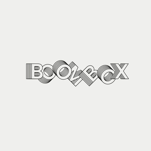
My favourite thing about studio DBD is the logo designs, they are so simple but work so well, just thinking of hidden concept will make the design really work. For example the Gaydio is a sound wave equivalent t an ear and the craft beer is shown through the top and the bottom of a glass with a missing middle. I plan to do more logo designs taking influence from this type of design, its something I want to Improve at.


These posters really caught my eye, the collaboration with the photographer to get these effects are really effective, they look mysterious to go with the name and they give an effect that makes me want to keep looking at them. Initially I though the text was hard to read and blended in a bit too much but I think this is the beauty of them, they make you need to read carefully then you take the information in and remember it.


Comentarios