Cinema 4D: Text layout
- Jodie Hirst
- Jan 27, 2016
- 6 min read
This term in Jay's workshops our aim is to learn to use 3D software as a design tool. For next 3 sessions we will learn different aspects of the program and how to make visuals with depth and interest. the skills we learn are transferable to any brief, or situation we may encounter, may that be static graphics or animation. Although predominantly a filmmaker and animators software, it’s aimed at graphic designers with motion graphics in mind. We are going to use techniques and experiments to consider cinema 4D and its visual side. The reason we are doing this is because although industry expect the obvious like Photoshop, in design and illustrator skills, they also expect that you have at least tried other programs from other disciplines such as after effects and cinema 4D.
We started by looking at channel 4 and their new brand, done by DBLG, they have a series of graphics that have the same effect that we will create, once learned, experiments can be done very quickly, we looked at the graphic above as an example and we saw how using particle and dynamic systems this effect can be achieved, its not just about graphic design but the background of the program.
Looking into these I actually really liked them, I like the simple ideas and I think this is a unique example. It’s also a technique that could be transferable to my logo because of the 4 geometric shapes i have involved in it.
The first thing we did was to prepare our art work in illustrator, to do so we had to centre the 0 point, for a static image the 0 point is in the top left hand corner, when working with 3D art the 0,0 point has to be in the centre enabling the X, Y & Z axis. To rectify this in illustrator we grabbed the top right hand corner of the rulers and puled it centre until the green line appeared to say it was in the middle. Anything that is done in cinema 4D has to be fixed to the right 0,0 point to work. I decided to use my own logo shapes, the only thing I had to be careful of was the fact that all artwork must be closed paths, open paths in cinema 4D creates flat shapes, not solid shapes. If working with text you can do so, however it must be turned into outlines and treated as separate shapes. we then saved it out into the right format, the only difference being that illustrator 8 had to be the format. Before we were able to open cinema 4D it was important as good practice to get our folder structure correct.

I have never used cinema 4D before and it sounds like a complex idea to me, I’ve never had to work with 3d graphics before, but I have seen how well they can work and the impact they can bring, I’m glad I have the opportunity to have a go and learn this, I really think it will come in handy in my coming projects. Cinema 4D is described as the biggest studio in the world, with an infinite amount of cameras, lights and paints, a virtual studio with unlimited potential.
The interface was unfamiliar to me however getting in to it I realised it wasn’t too complex on the face of things. We set up the project by first changing the area we work on to landscape and changing Cm to Mm, resolution must always be set to 300 dots per inch, any less will make a render output bad quality.
Because we were staying static and not moving we changed the frame rate to current rate. We set up our viewpoints so we knew where we could work up to, blacking out the outer spaces. To give us a safe working space we made a gutter to know where the line was that we should not go past,

The reason this is used on cinema 4D is because in older time when TV's were curved and images wrapped around them, parts of images were lost, this isn’t a problem now however its still always best to work within the line. In 4D its not import its merge instead but it does the same thing, select art work and put scale at 1Cm, you should then get a white line indicating artwork. The artwork may not be at 0,0 to do so use co-ordinate tab to 0 it out.

After effects is done in layers and cinema 4D works in a similar way however the folder is separated into different objects, we were advised to keep them grouped so they could be moved as one. Through the project we could render the view out to see what it would look like on our output. We extruded our first object and went through the process, I thought the drag and drop approach was simple, it was easy enough for me to remember and I was shocked at how simple it seemed. To move around the space we were shown the 4 icons in the top right hand corner, I had a few problems working with these and understanding where they moved and how they moved around the space, but after some practice and getting further into the project I started to understand, however I do think I need more practice.


When we rendered our first piece of the logo, we saw that the object had a sharp edge, it gave away the fact it was computer generated and its bad practice, its better to soften them to do so we played around with the caps and this gave a much better edge, by simply creating highlights and bevels.

We were then asked to do the same with the other components of the logo, I knew how to do this and I did it with no problem however I had made a mistake earlier in illustrator I had a path that as not closed so no solid shape was appearing, to rectify this I simple went into illustrator and edited my art work, however it wasn’t what I wanted it to look like, it was just for speed that it ended up how it did, I can change this when I do some more experimenting on the program, which I want to do I think the results could be amazing for me to work with. We also learnt shortcuts for doing the same thing to each part of the object.
A lot of people had done text as their logo, but it seemed that in cinema 4D, you could use MoText and get the same effect but quicker. One thing we had to be careful of was that when working in the perspective view, you cant see it artwork lines up correctly so by looking at top right and side views you could line the artwork up correctly, again at first glance I had no idea what to make of it, but after I had some practice I started to understand.


The object was flat and the moment and to give it depth we started to add backgrounds and floors, we made sure the logo was hovering above the floor and that we could see the horizon otherwise the background was not visible and the depth could not be achieved. To add shapes click at the pen tool at the top, editing the same way ad extruding objects. I couldn’t see any colour options but double clicking on the timeline at the bottom made them appear, create a colour then dragging it onto a layer activates that.
Even though we had a floor and background we had to light or shadow to indicate this, so at first we added a camera and set a angle that we wanted to look at. Then adding light we clicked the bulb at the top, everything went black but then if you used the X, Y & Z axis the light would appear. One thing I did was put the light behind the object so it was really dark, you have to make sure that its over the right shoulder of the camera and at the front of the object, this creates a nice effect.

To add shadows we changed shadows from none to shadow maps (soft), make sure shadows is ticked in the view menu, now the shadow appears but its harsh and off, using the arrows change the positioning and to make the shadow softer we had to use a fill light, Turing the shadow off and with the top view use the red arrow to make it disappear. Because there are two lights they don’t both want to be white, so change one to a tint of blue and one to yellow, 5% at the most.

To add subtle effects we added a visible light, giving a slight sheen, too much was horrible but just right made it more realistic, we did this by activating it and making the circle viewpoint as big as we felt worked. We then rendered it out using the orange buttons at the top and saving it as a JPEG, after closing the settings button, clicking the middle button will start he rendering.

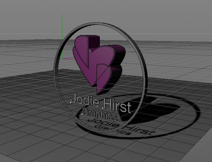
Above is my finished artwork, during the project I wasent sure I was going to like my outcome, one reason was beacsue the heart shape is not what my logo is, although I think done again, I could make this look good with my real logo becaause of its sharp gemometric shape I really like the effect of shadows and light thats subtle but works well, I definatly want to try this again.


Comments