Book Cover Development
- Jodie HIrst
- Feb 16, 2016
- 5 min read
Before thinking too much into my book cover I was creating a logo so I played around very briefly, I likes the idea of the background to the cover being the logo but in different colour, however at this sage I wasn’t sure what my logo was going to be and I wasn’t 100% happy with what I was producing digitally. I’m not sure this gives the right effect I wanted. Although its bright and catches the eye, I think simplicity can get this effect too and I think it needs to be more simple to understand exactly what the book is going to be. I found later that I was adding random things onto the logo without any intention or point to it, but instead adding it t make it look more 'cute' and crafty. What I realized was that what really made something crafty was the handmade aspect of it.

I then decided to simplify it down, still using digital techniques, I used my finished logo to create a sort of circle pattern around t, symbolizing the idea of direction, and being able to go anyway and there are no limits to what you can and cant do. I really liked the circle idea which is why my logo was structured like this, I tried in in a variety of colors and I liked the multi-colored pastel cover below however it just didn’t work, I then tried it in blues and I started to prefer it, but again there was something that was not quite right, I wanted it to look more personal and at the moment it was looking generic and something you could see in an Tesco near you.


After looking at these covers and thinking about it in depth a little more, I wanted the covers to capture attention and I think decisions determine destiny is less relevant than the question I am trying to ask people, 'what will your future look like?' It was then suggested that I should do everything hand drawn and scan in, create fonts every detail should be done by hand to generate a hand drawn and personal journal effect. i looked at using a typeface I created last year however after I had done all the type in this it was too harsh, the typeface didn’t have the effect I was going for.


After this I decided to look back at my digital designs and get some inspiration from them, a digital typeface I had used was KG A bit of swag, this made letters appear in this way below, in separate flags. I think it was a nice look, it looked more personal and I think hand drawn it gives a goof effect. I made the logo for the whole thing a hand drawn text but didn’t make it the focal point, instead placed it smaller in the top right hand corner. I liked the idea of the blues however the white background was making it hard to see. So I tried different backgrounds and found a dark teal worked well with the font and feel of the cover. However this wasn’t my final, I still believed this cover could be better; it could have more personality and be more interesting as well as being simplistic.


After this cover didn’t satisfy what I wanted, I started to look around for inspiration; I looked at illustrative type and found that illustrations within type were something that could look very effective. I knew I only wanted that question on the cover and I thought this could be a good way, I first tested the idea below on a small scale and it worked well, I really liked the contract in black and blue colour with a vector but hand drawn combination by using a simple image trace.


So I decided t do the whole question in this way. Initially creating the illustrations to fit the font took time, but when I got a full letter I could adapt I to make the other quite quickly. Because I had already done these illustration on the computer I fitted the illustration in, printed them, hand drew them and then scanned them back in using image trace and expanding to rearrange and fill in colour and lines. I had a little trouble when printing because of how small the illustrations were so I split the w in half and did 1 A4 page per side and this meant that the illustrations were clearer.
The idea behind this was that the illustrations are representing all the different ways you could go in life. I used a variety of different background and found that the grey background swallowed up the illustrations but the contrast of the pink worked well and made the words pop. My favorite was using wither the same blue or a white as a background I thought it stood out as well as working well together.


After I completed all the different letters I placed them together and started to play around, I tried to use a patterned background but I thought it was too busy and the illustrations got lost and too small to see. This was the problem I encountered when I added any background and placed them in many positions.

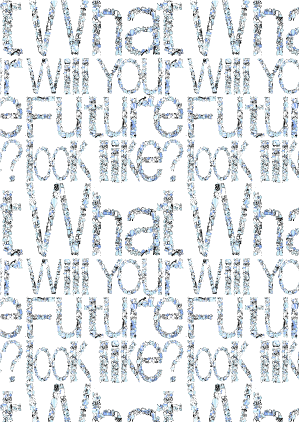


I started to try and make the illustrations more obvious and eye-catching but these ways didn’t do anything for me. Although illustrated by hand they were becoming too complicated. I also found that the blues I was using were cold and I think talking about a future should be full of colour and interesting to look at. Because I was struggling to find the right looks for my front cover, I decided to move on. I was getting so caught up on this it was stopping the progression of my book.


Hand made cover
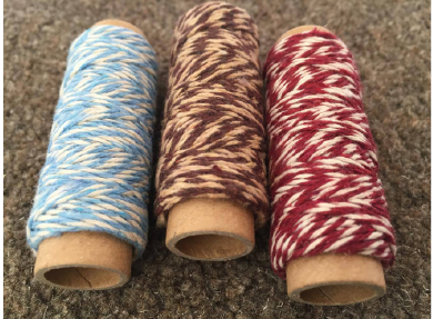
I had decided to leave the front cover until i had don the rest of the book, as this would gave me an indication on the style of the book., and it did exactly that. once i had created the book from scratch and binded it toegther, realised how handmade this book was going to look and i decided the front cover should carry on that theme. so i got some wooden letters that i stained to make them a better colour and simply wrote your future on the front. i then tied some twine in a complimentary colour to hold the book toegther. i think it really works and after trying to get the right front cover digitally I'm glad I moved on and tried something more hand made, i think it finishes off the book well.


Comments