Milestone Development
- Jodie Hirst
- Feb 16, 2016
- 4 min read
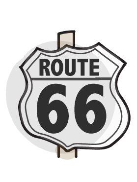
The idea behind these illustrations would be that they were printed onto smaller cards making up a pack, these cards can be swapped and changed inside the book, where slots will be available so that users can change their dream and nightmare milestones through their life.
I wanted the illustrations to be simple but look familiar so that they can be recognizable, the first illustration I did was the getting married one and it went really well. I managed to find a style that I really liked. It wasn’t completely polished or neat but the style suited the illustration and style of my book. However when I moved onto the other illustrations the style worked with some and not with others, this was causing problems. I really liked some of the illustrations and didn’t like other; I had to think about it in a more logical way. There was something about them I just didn’t like. I tried some in grey scale and using just line to test and develop. However I still found this wasn’t giving the effect I was going for.
I looked back at the inspiration I was looking at and I realized that there was a problem with my work overall, I wanted a hand drawn effect but I was doing everything digitally. So I then started to draw these illustrations by hand and scan them into the computer.
One thing I found difficult was getting the balance between authentic hand drawn effect and Turing the images vector using image trace. I didn’t want to smooth the edges too much I wanted to leave the hand drawn effect and although this was tricky at first, I think I eventually managed to find that balance.
here’s the difference...
I think the drawn version scanned in is crisper but also had the hand drawn jagged effect. Because of this, I am going to hand draw all the milestone illustrations for the book.
I wanted to do illustration for this project because I had never done it before and I thought it could be a fun thing to do that would broaden my skills. I decided it was time to take some risks.
I used a graphics tablet and illustrator to create the outlines and colours of these milestones, I tried them using just lines and grey scale and although the colour was the best I wasn’t sure on them. The first one I did was the marriage milestone and the style really fit the illustration but as I moved on the illustrations were starting to look messy and unfinished rather than a particular style. I wasn’t happy and I wanted to find a way to fix this. I then realised that although the tablet was hand drawn it would give me a better effect if I really did just draw them. So I did, I drew then scanned them in and only made it s the outlines were thin and a little unfinished this gave a good drawn effect and the colouring in although looked a little more vector defiantly worked better for me.
I thought about how I could improve them to make them more handmade and I realised that if they were printed on paper that wasn’t average they might have some spark. I tried rag paper and loved it straight away. It had a real crafted finish to it and I really like the mix and contrast between hand made and digital that I have brought together.
Before deciding on the drawn aspect, I tried the drawn effect using different materials like markers, watercolor, inks, and pencils. I also tried out the idea of making the illustrations from card, building up layers for detail, but that wasn’t something I liked the look of.
I tried many different papers; some with imprints in them and different thicknesses just to see what I could make from them. What would work for me and the style I wanted for this book.
milestones and printed
Milestone cards
I had started to move on with my book ages and I now knew the style I was going for, after printing the milestone son the paper I had chose I really liked the effect I knew that what I wanted to use. My next decision was how I wanted to display the millstones in the book and how they were going to be placed in and out. I cut a circle around the milestones and I cut all the way to the edges, but I found the best was to cut them out as squares. I liked this idea and thought I should add a description to the bottom as I was going to do this separately.
I saw how the colours turned out o the paper and deiced that the best was to present the cards would be how I have to the right.
I went thought a series of ways and layouts to find the right one, but I wanted them to be simple, they needed to be understandable and because they were going to be a set of cards I wanted them to be all the same style and layout, the only difference was the colours and even they were all kept pastel and light.


Comments